A post on why proofing your print is important.

20:49

Here is my latest little print. I thought I would enter it in this competition Not because I thought it could win or should win but just because there seemed to be 1000's of photographs (mostly of water drops exploding) and someone should do something a bit different. Right?  Just for the sake of variety.

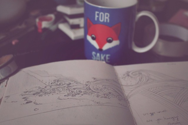
It's a tiny ark in a bottle. It's perfectly safe bobbing around in there. I was drawing it for a friend as an ideal domicile (you'll have to read the listing for the details of that), and I thought I've show you some of the workings.

I don't have the sketch because I drew straight onto the acetate, but I have the first proof on the right, and you can see, it's quite different. Firstly, I had to move the ship to get the cork in the right place, which meant blocking out a bit of the boat where the wave goes (you'll have to play spot the difference!) then I re-did the bottle completely, with the highlights higher up so they didn't get confused in the water, and a banner that says 'this too shall pass' (very nautical tattoo, I thought).

The thing that bothered me most, though, was the colours of the proof. The water was too light and got drowned out (ho-ho!) by overprinting the bottle, and the two colours were far too similar for it to be eye catching as an image. So I made the darkest blue print darker, and the lighter blue greener. I was very pleased with the result (even though there was a lot of extra work to fix things up). Doesn't it look much better?

I hope you enjoyed that digression into my working methods, anyway.


You Might Also Like

8 comments

Instagram